Thanks to their visual simplicity, bar graphs are popular tools for representing data. But do we really understand how to read them? New research from Wellesley College published in the Journal of Vision has found that bar graphs are frequently misunderstood. The study demonstrates that people who view exactly the same graph often walk away with completely different understandings of the facts it represents.
“Our work reveals that bar graphs are not the clear communication tools many had supposed,” said Sarah H. Kerns, a 2019 graduate of Wellesley, research associate in its psychology department, and first author of the paper, entitled “Two graphs walk into a bar: Readout-based measurement reveals the Bar-Tip Limit error, a common, categorical misinterpretation of mean bar graphs.”
“Bar graphs that depict mean values are ubiquitous in politics, science, education, and government, and they are used to convey data over a wide range of topics including climate change, public health, and the economy,” said co-author Jeremy Wilmer, associate professor of psychology at Wellesley. “A lack of clarity in domains such as these could have far-reaching negative impacts on public discourse.”
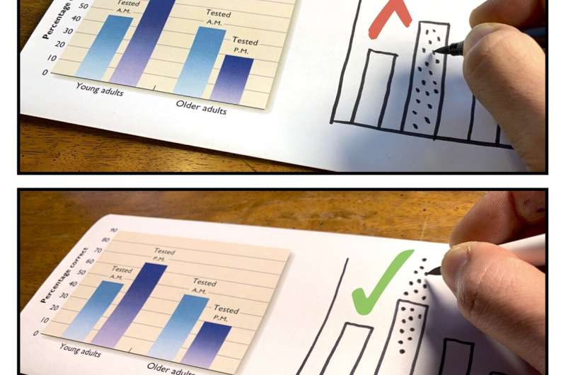
Kerns and Wilmer’s revelation about bar graphs was made possible by a powerful new measurement technique that they developed. This technique relies upon having a person draw, on paper, their interpretation of the graph. “Drawing tasks are particularly effective at capturing visuospatial thinking in a way that is concrete, expressive, and detailed,” said Kerns. “Drawings have long been used in psychology as a way to reveal the contents of one’s thoughts, but they have not previously been used to study graph interpretation.”
The research team asked hundreds of people to show where they believed the data underlying a bar graph would be by drawing dots on the graphs themselves. A striking pattern emerged. About one in five graph readers categorically misinterpreted bar graphs that depicted averages. “These readers sketched all, or nearly all, of the data points below the average,” said Wilmer. “The average is the balanced center point of the data. It is impossible for the bulk of the data to be below-average. We call this mistake the bar-tip limit error, because the viewer has misinterpreted the bar’s tip as the outer limit of the data.” The error was equally prevalent across ages, genders, education levels, and nationalities.
Given the severity of this error, how could decades of graph interpretation research have missed it? “Previous research typically asked rather abstract, indirect questions: about predictions, probabilities, and payoffs,” said Kerns. “It is difficult to read a person’s thoughts from their answers to such questions. It is like looking through frosted glass—one may gain a vague sense of what is there, but it lacks definition. Our measurement approach is more concrete, more direct, more detailed. The drawings provide a clear window into the graph interpreter’s thinking.”
“A major lesson from this work is that simplification in graph design can yield more confusion than clarification,” said Wilmer. “The whole point of replacing individual values with a summary statistic like an average, is to simplify the visual display and make it easier to read. But this simplification misleads many viewers, and not only about the location of the individual data points that have been removed—it misleads them also about the average, which is the one thing the graph actually depicts.”
The team suggests some changes in data visualization practices based on their findings. First, they recommend that a bar be used only to convey a single number, such as a count (150 hospital beds) or quantity ($5.75): “In that case, no data is hidden,” said Kerns. “In contrast, our research shows that a bar used to depict the average of multiple numbers risks severe confusion.” Their second recommendation is to think twice before replacing concrete, detailed information (e.g., individual data points) with visually simpler yet conceptually more abstract information (e.g., an average value). “Our work provides a case-in-point that abstraction in data communication risks serious misunderstanding,” said Wilmer.
The team’s education-focused recommendations include the use of data sketching tasks to teach data literacy. “Once a student’s interpretation is made explicit and visible on paper, it is easy to discuss and, if necessary, correct,” Wilmer said. They also suggest having students work with real data. “Data is fundamentally concrete,” Kerns said. “There is value to reading about it in the abstract, but that will always be a bit like reading a book to learn how to ride a bike. There is no substitute for hands-on experience.”
Collection, visualization, and analysis of data now form a centerpiece of all of Wilmer’s courses. An enabling tool in this effort is a free-access suite of data visualization web apps he created at ShowMyData.org, which allow the user, in a matter of seconds, to build and curate attractive, high-quality graphs with individual datapoints. “Such graphs avoid the sorts of errors that our research reveals,” says Kerns. “And they are easily interpreted, even by young children,” adds Wilmer, whose children, aged 11 and 7, are “two of my most astute (and ruthless) app development and data communication consultants.”
Source: Read Full Article
